Video: View customer monitoring insights
Last updated: October 13, 2026
In this guide, you will learn how to access and analyze customer monitoring insights in Mesh.
When logging in to your account, please ensure you select the correct region, which will be one of the following:
Australia: https://au.mesh.complyadvantage.com/
You can find the link to your region in the onboarding email you received (look for the "Welcome to ComplyAdvantage" email).
If you can't find the email, don't worry! You can always contact our support team at support@complyadvantage.com.
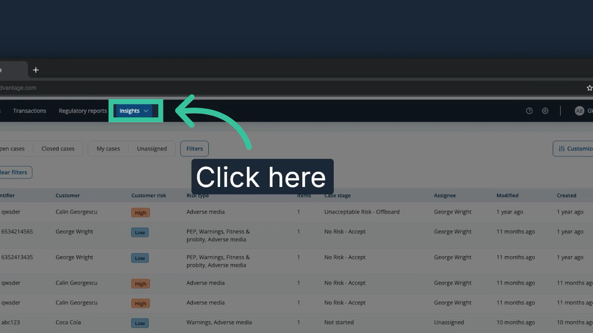
1. Click "Insights"
From the Cases tab, click "Insights". Insights dashboards need the Supervisor or Admin system role, or a custom role that includes insights dashboards and, for exporting charts, exports and downloads.
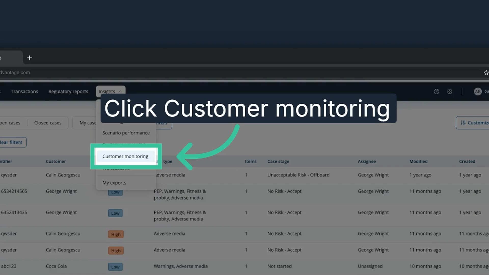
2. Click "Customer monitoring"
In the Insights menu, click "Customer monitoring" to open the customer monitoring dashboard.
3. Review the headline metrics
The top of the Customer Monitoring dashboard highlights key data points about your monitored customers. The headline metrics are the following.
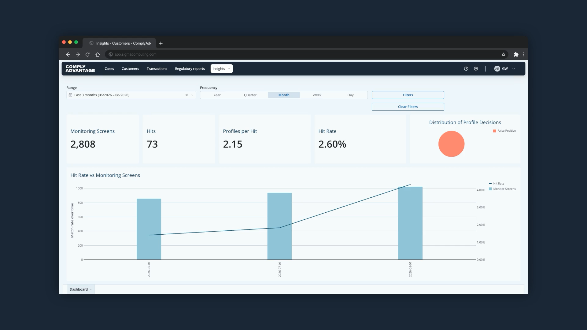
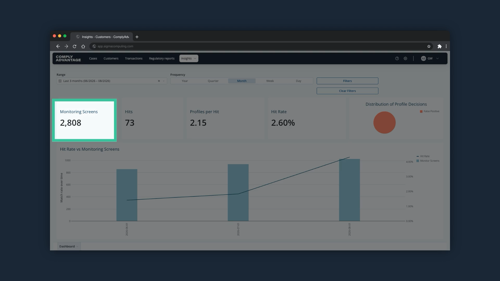
4. Monitoring Screens
The number of times monitored customers were re-screened.
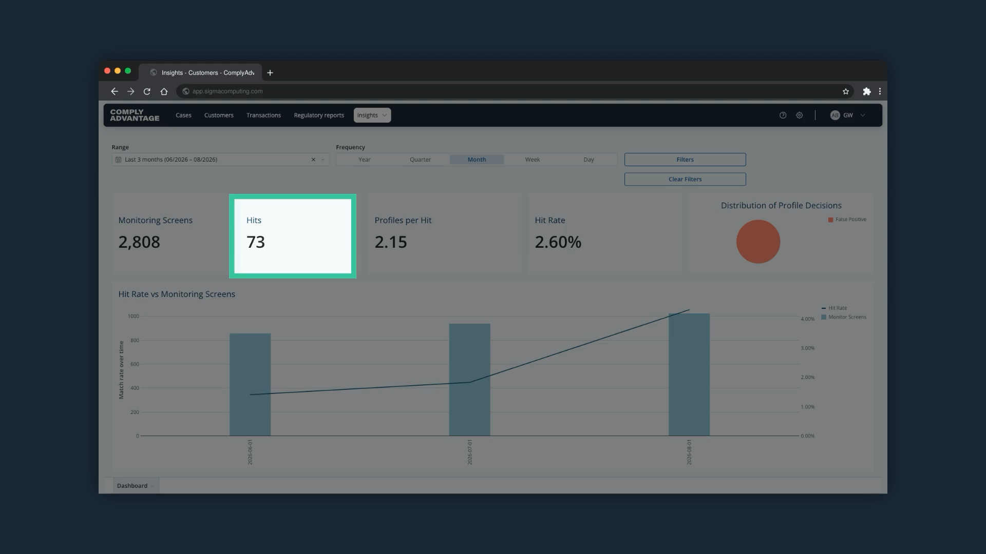
5. Hits
The number of monitored customers that returned profiles for your analysts to analyze during monitoring.
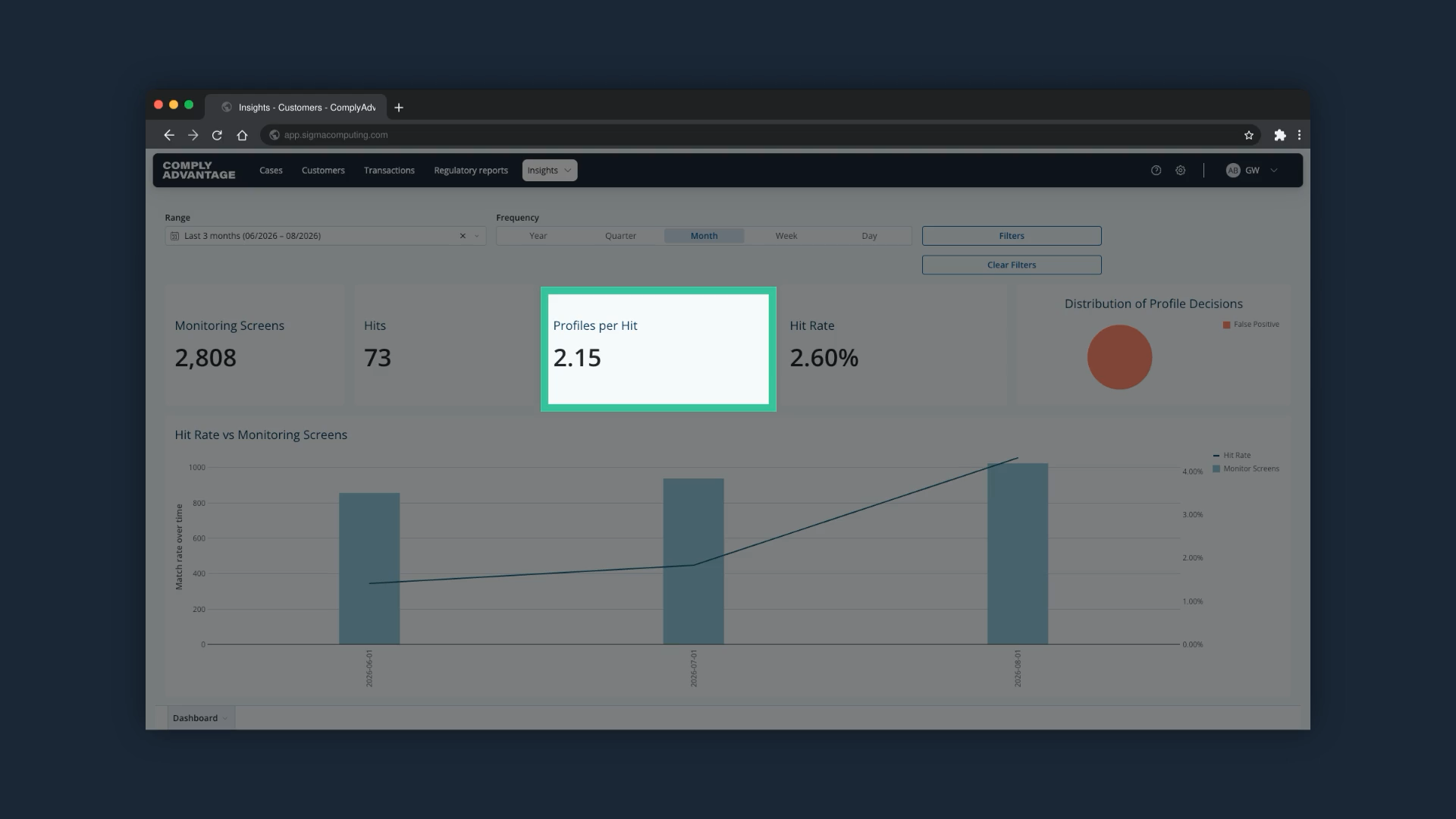
6. Profiles per Hit
The average number of profiles associated with each hit. A high number here usually means your matching is too broad: you are getting a lot of potential matches per customer, which means more work for your analysts.
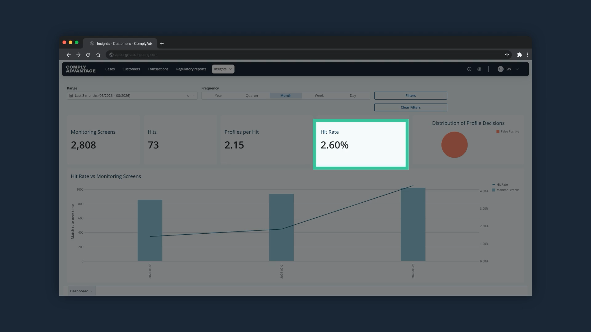
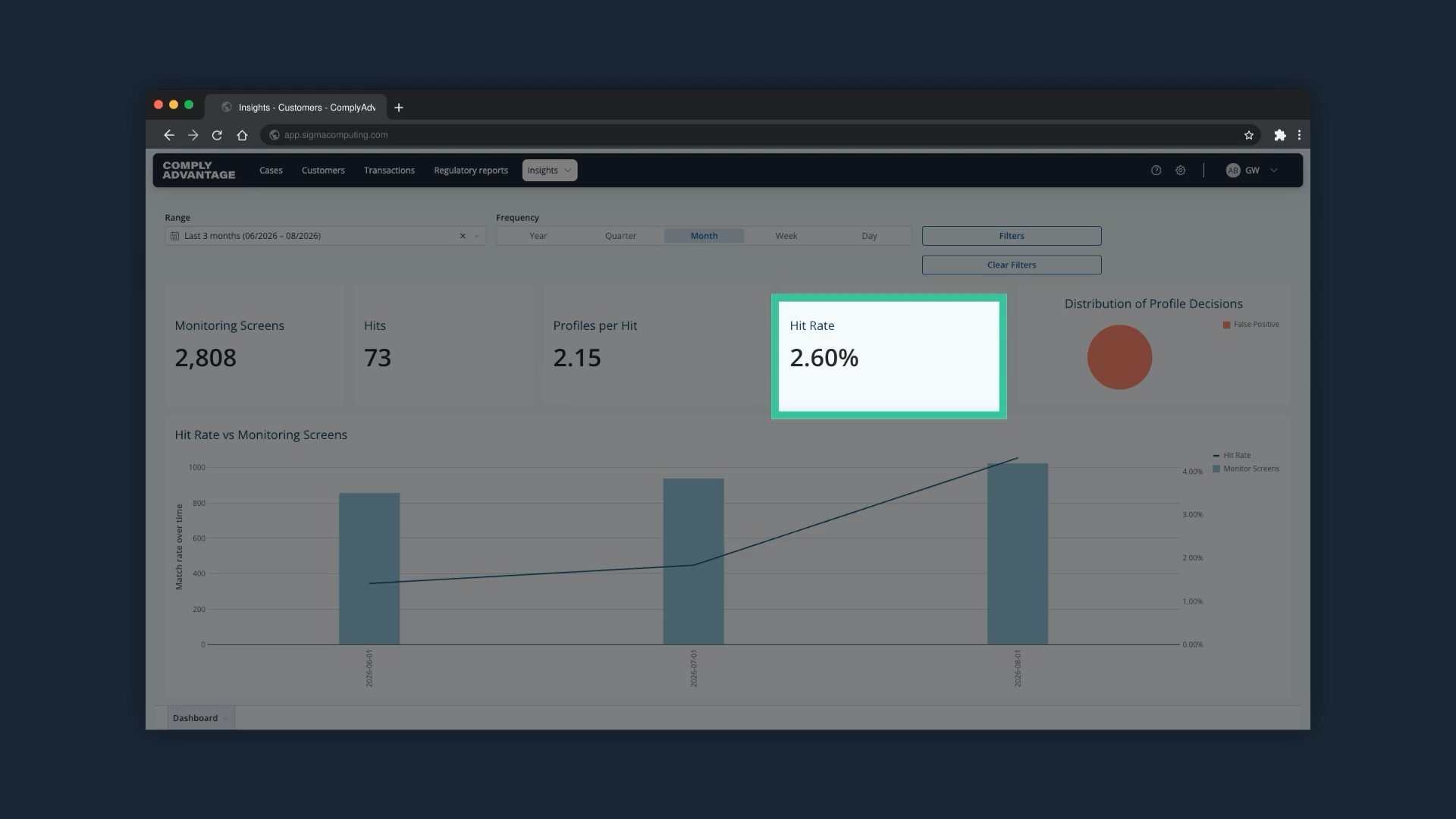
7. Hit Rate
Hits as a proportion of monitoring screens. A very high hit rate, say 30 or 40%, is usually a red flag. It typically means your screening configuration is too sensitive and is flagging customers who do not pose a risk, which creates noise and analyst fatigue. Screening configurations are managed by Admin users.
8. Distribution of Profile Decisions
The breakdown of true positive against false positive matches.
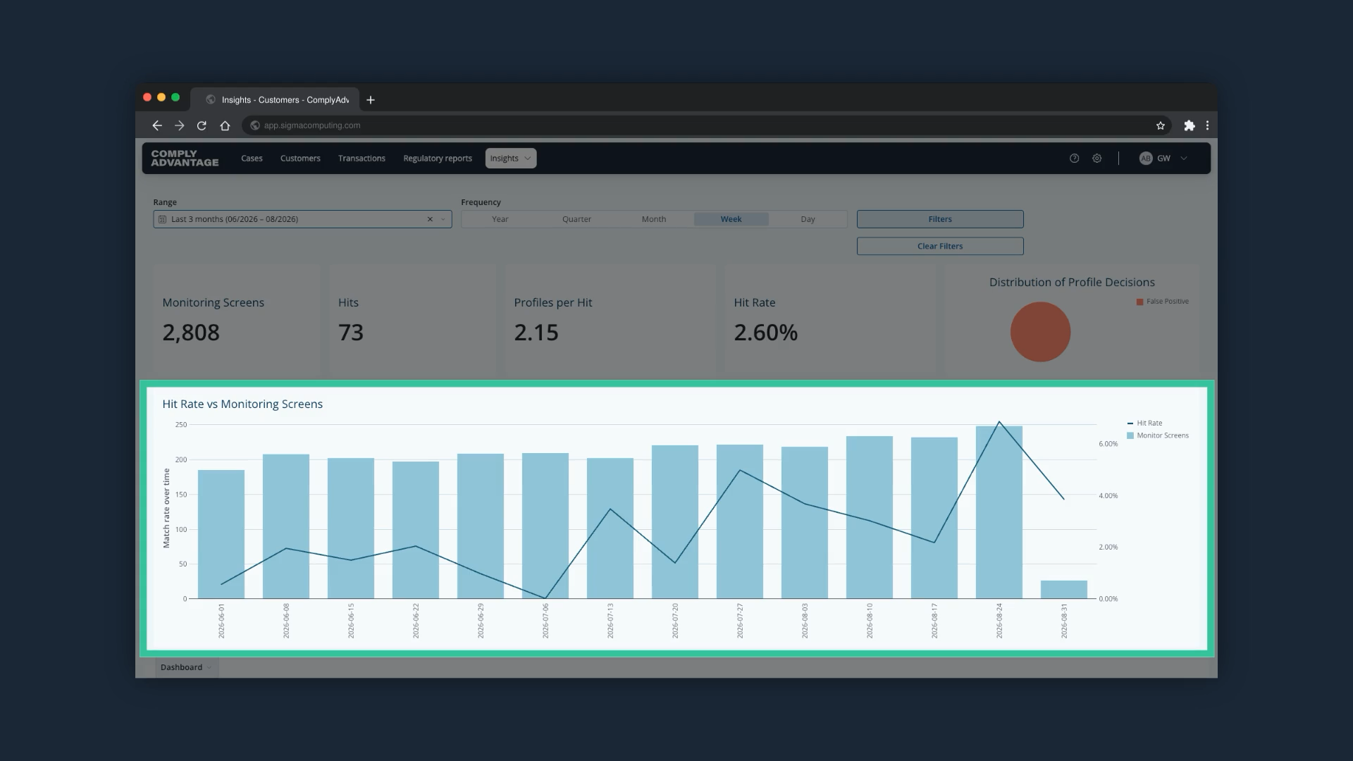
9. Hit Rate vs Monitoring Screens chart
This chart shows the number of monitoring screens over time against the average hit rate across them.
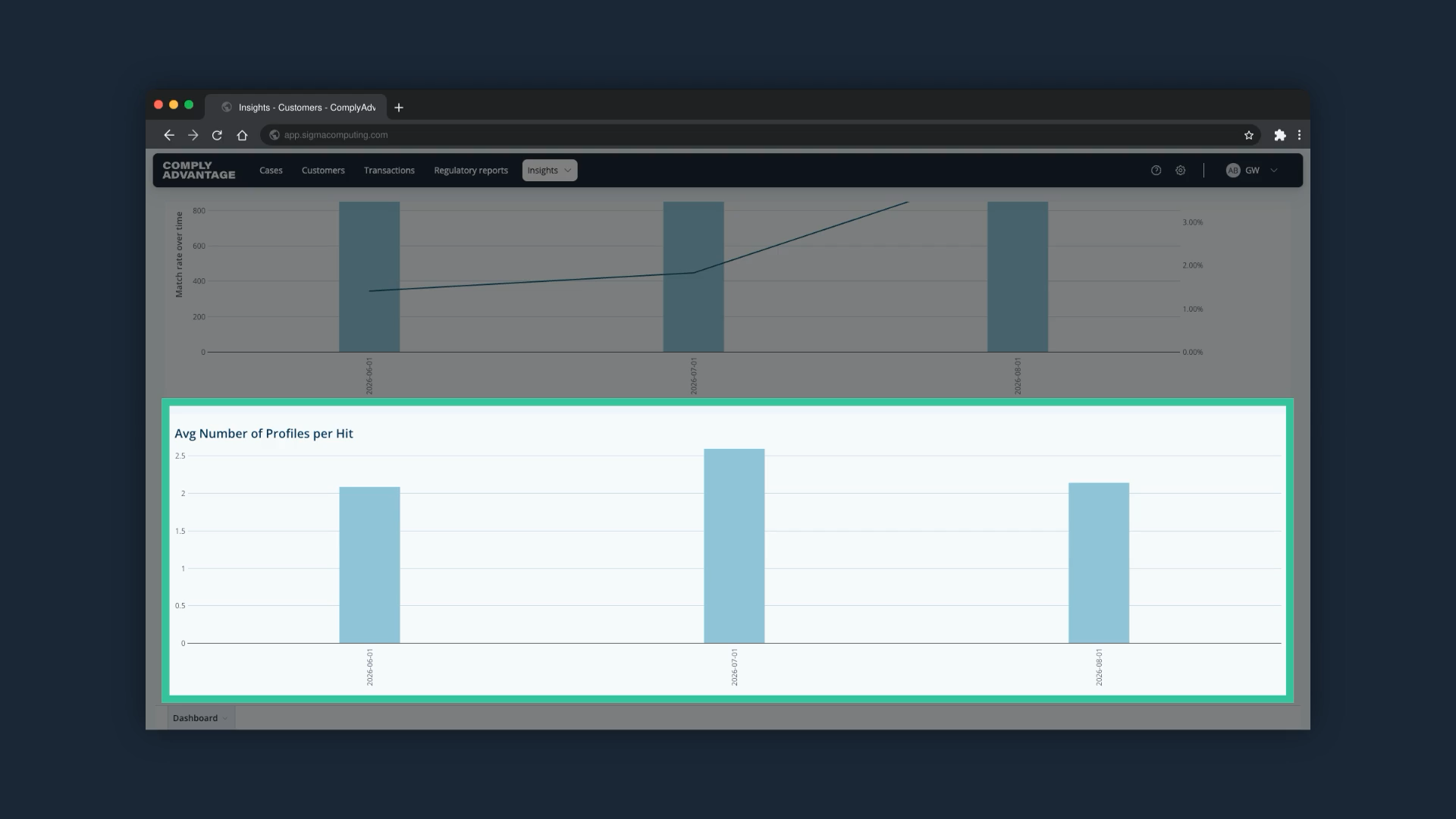
10. Average Number of Profiles per Hit chart
Scroll down to find this chart. It helps you assess whether your monitoring settings need adjustment.
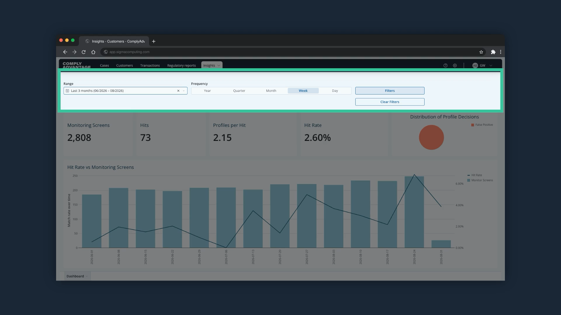
11. Set the range and filters
At the top of the page, the "Range" selector lets you choose the dates the insights cover, for example the last 3 months, and the filters let you focus the analysis on specific properties of cases.
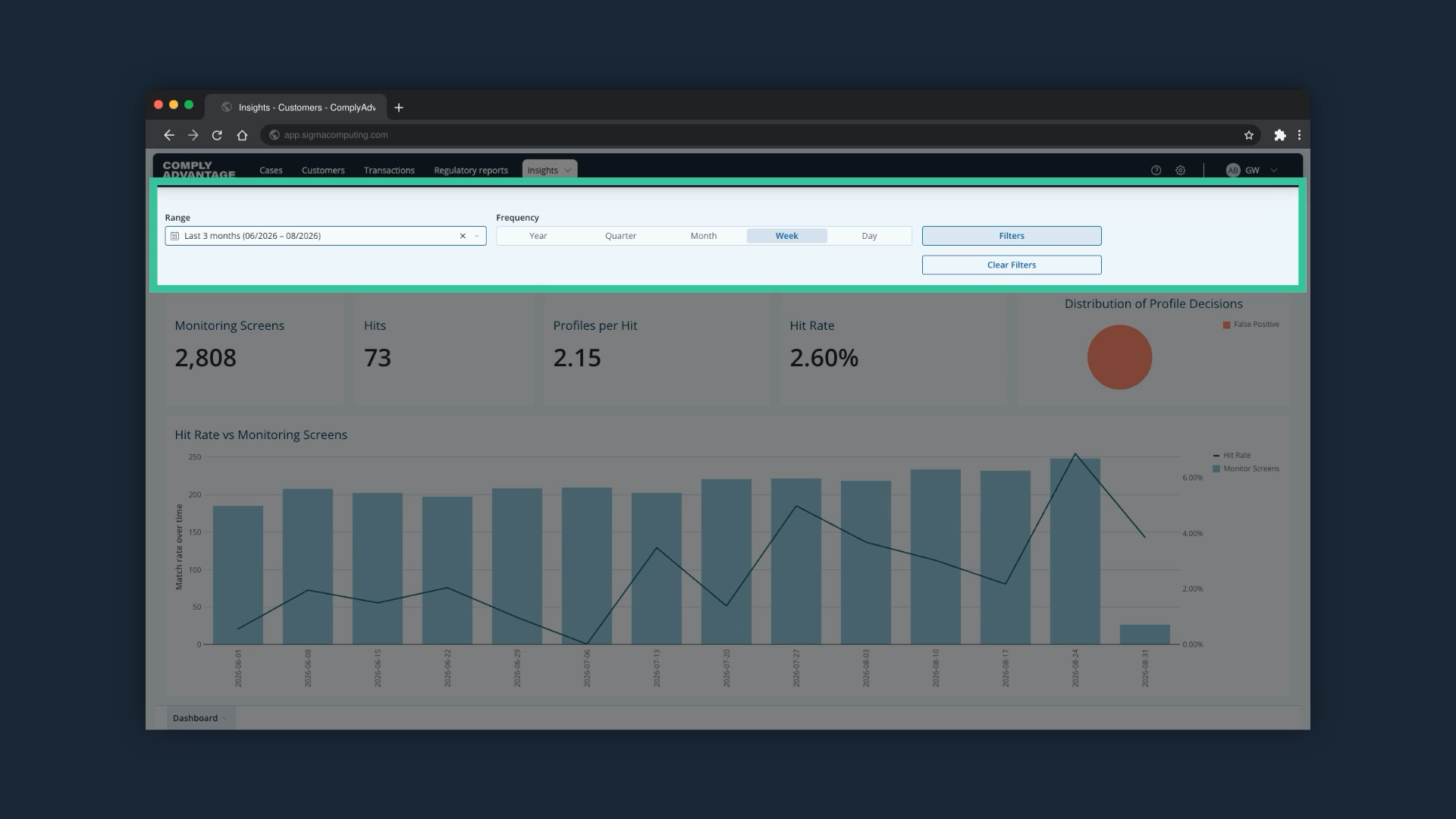
12. Frequency
The "Frequency" options, from Year down to Day, change how often data is aggregated and displayed in the insights.
13. Click the three dots on a chart
Click the three dots on a chart to see additional options.
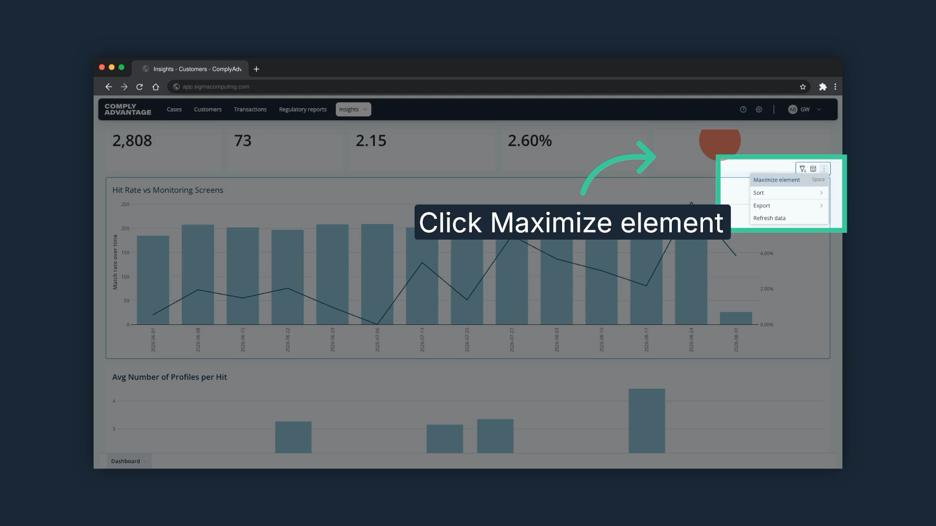
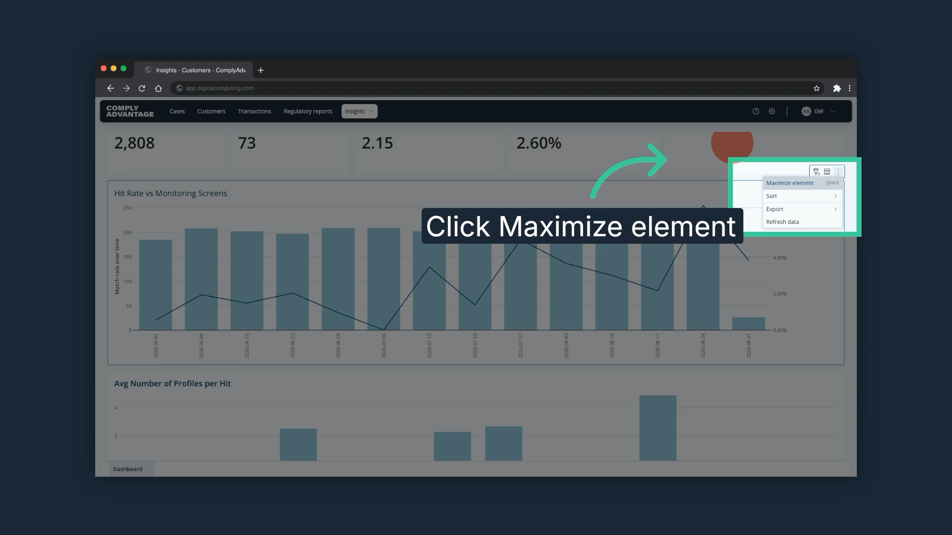
14. Select "Maximize element"
"Maximize element" shows the chart in full screen mode.
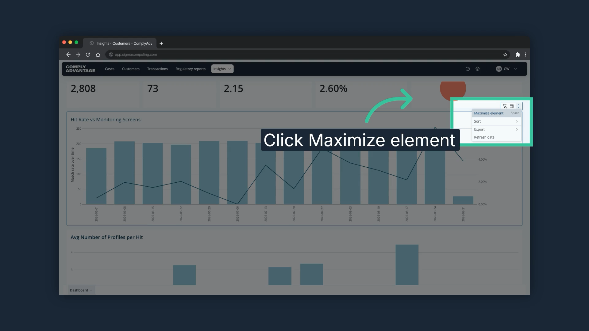
15. Export or refresh the chart
"Export" opens the options to download the chart, including as a PNG file, and "Refresh data" refreshes the chart.
We hope this guide helped you learn to apply filters, export data, and navigate monitoring screens effectively for enhanced reporting capabilities.