Video: Viewing insights into cases
Last updated: October 13, 2026
In this guide, you will learn how to view and analyze the Cases insights tab in Mesh.
When logging in to your account, please ensure you select the correct region, which will be one of the following:
Australia: https://au.mesh.complyadvantage.com/
You can find the link to your region in the onboarding email you received (look for the "Welcome to ComplyAdvantage" email).
If you can't find the email, don't worry! You can always contact our support team at support@complyadvantage.com.
1. Introduction
As always, our starting point is the Cases tab in Mesh.
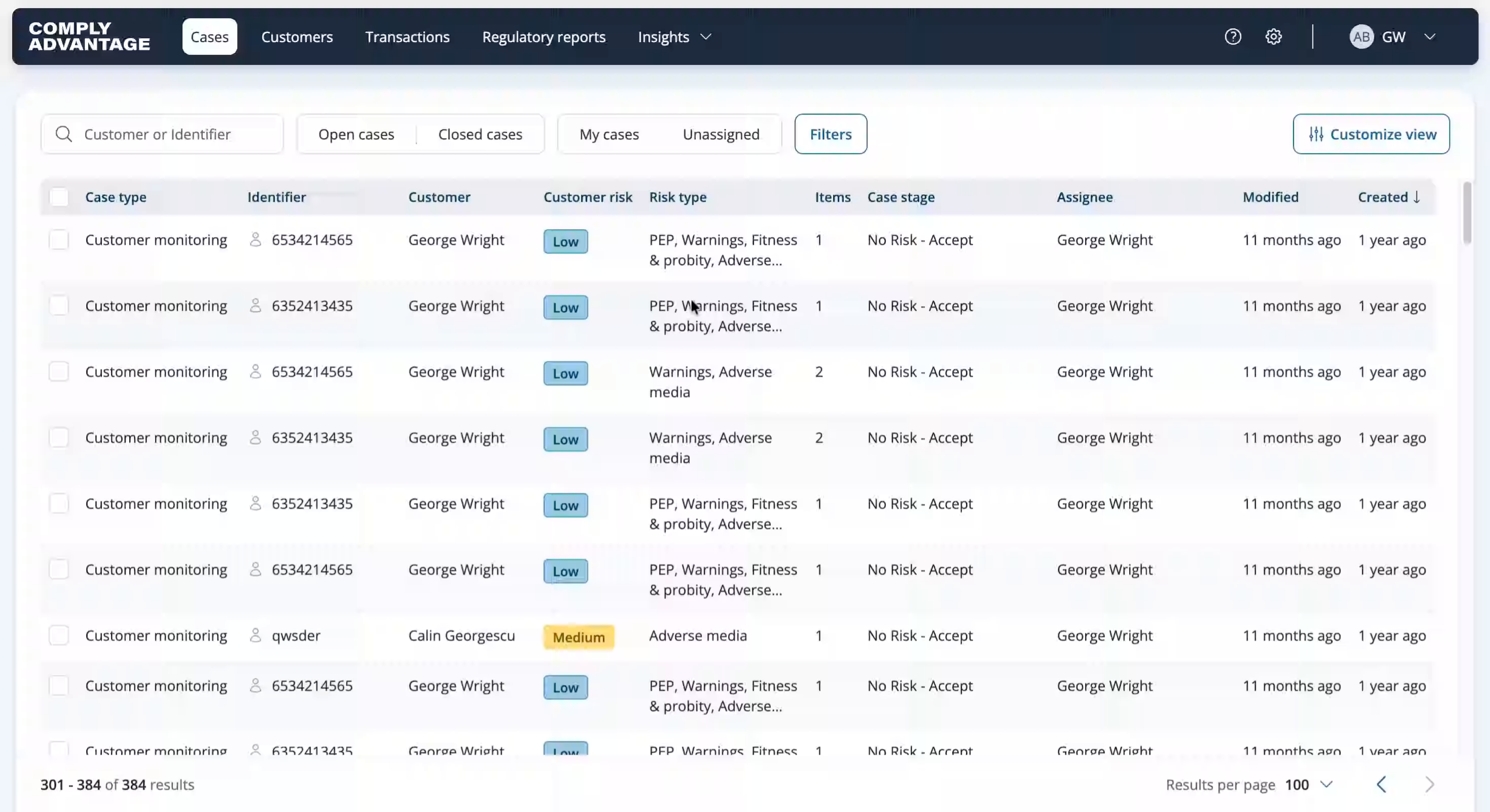
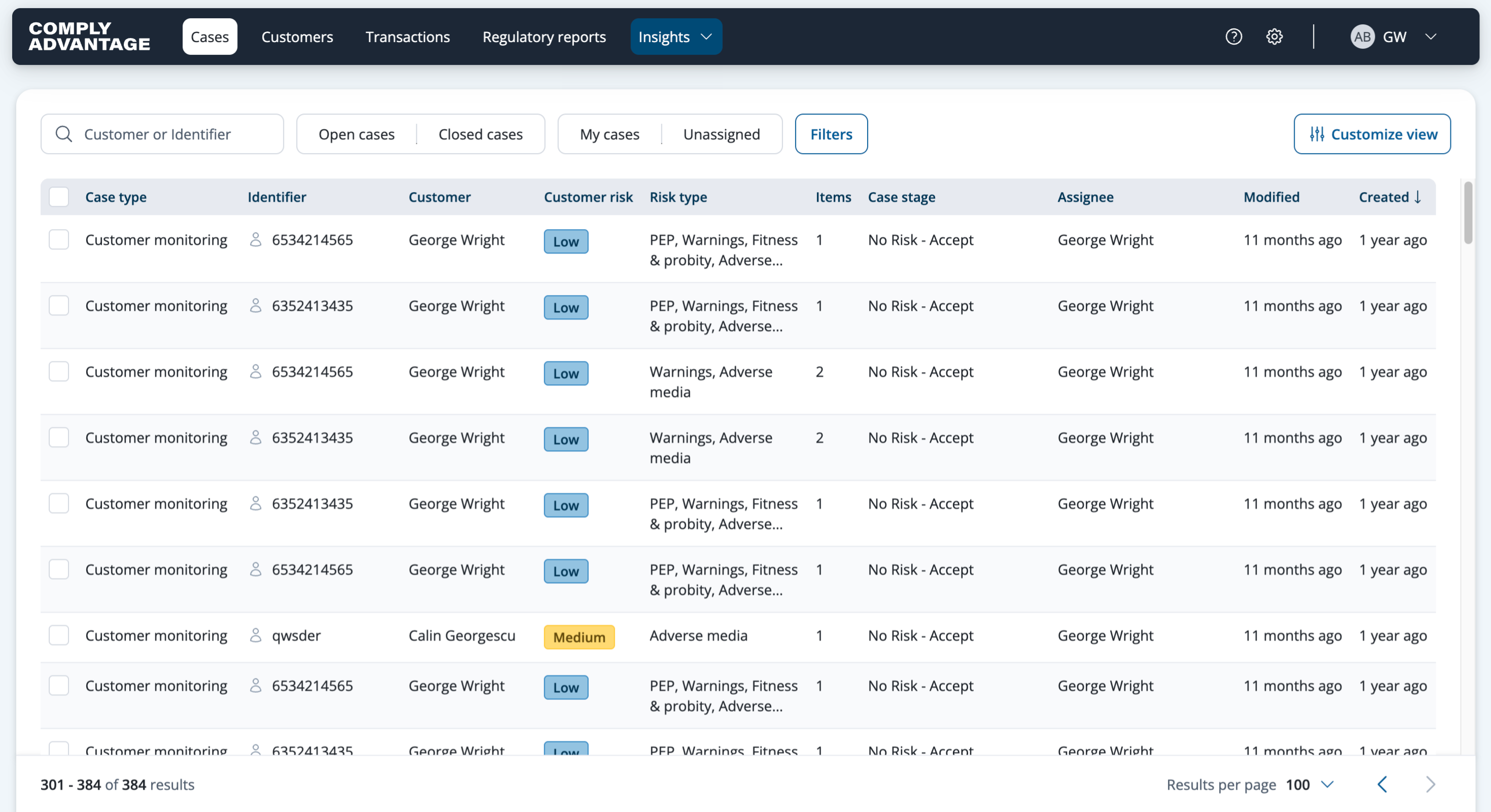
2. Click "Insights"
From here, click "Insights" on the top banner of the platform. Insights dashboards need the Supervisor or Admin system role, or a custom role that includes insights dashboards and, for the PDF export at the end, exports and downloads.
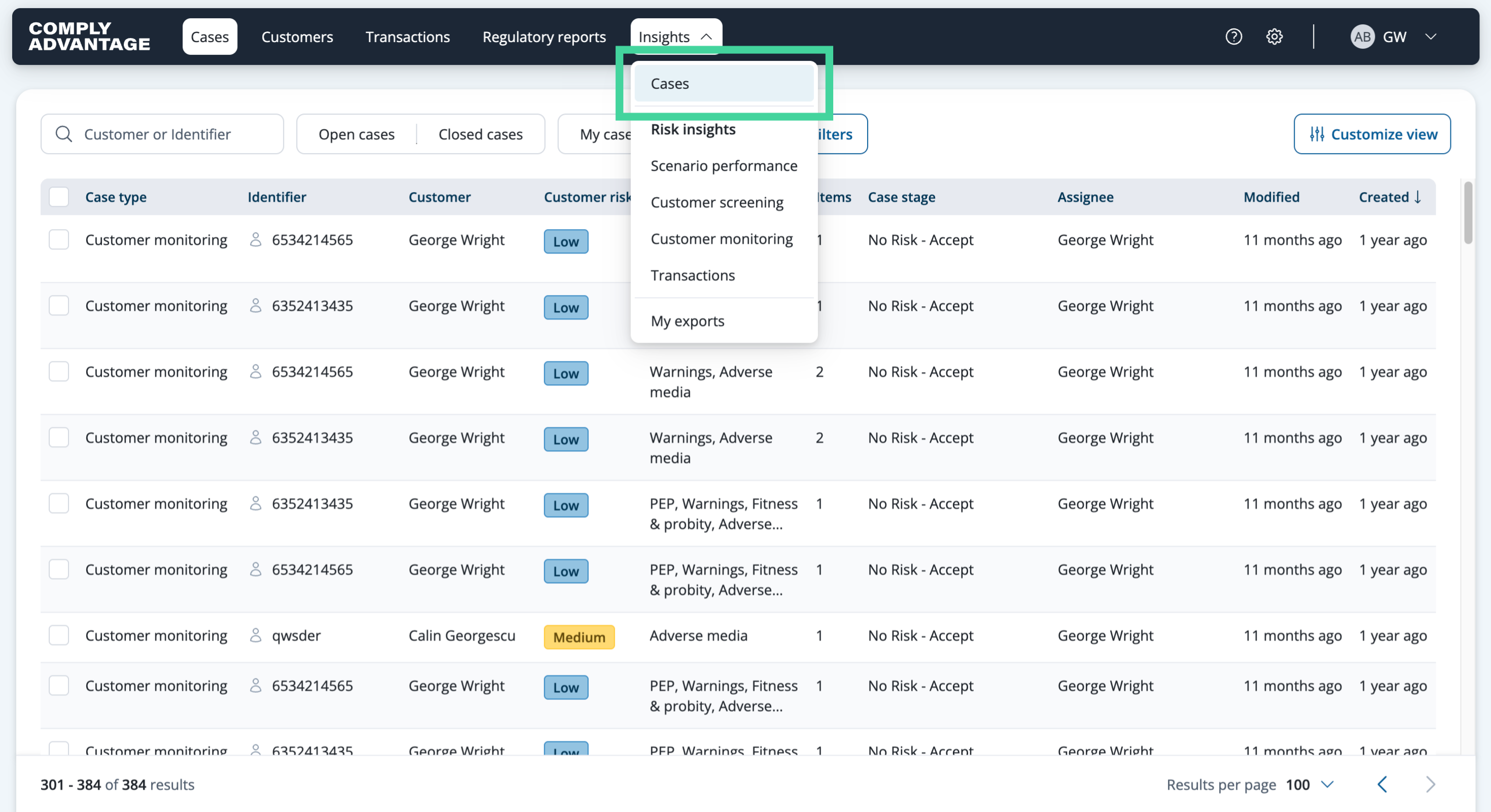
3. Click "Cases"
Then select "Cases".
4. Cases insights page
This brings you to the Cases insights dashboard.
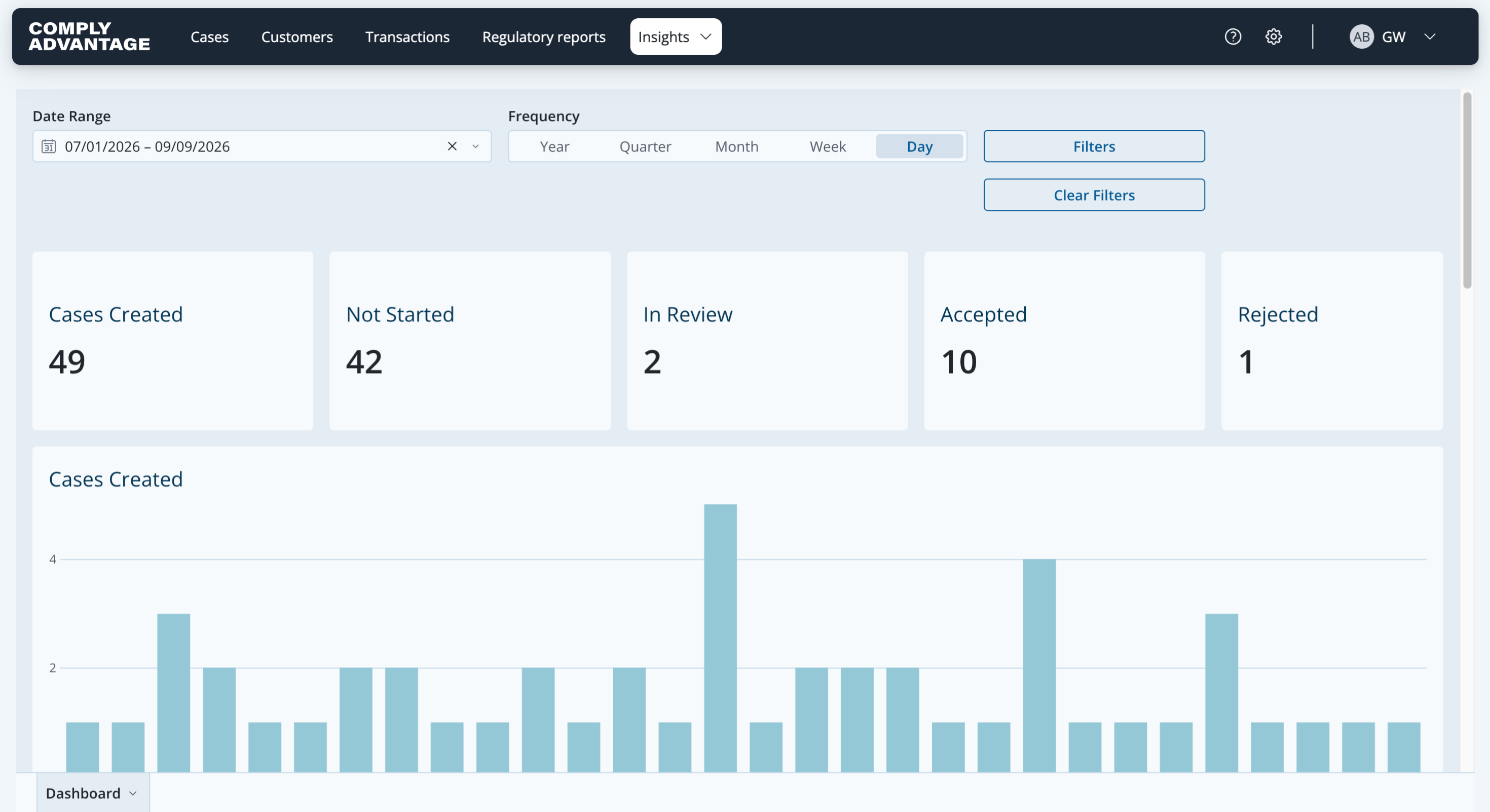
5. Open the insights details
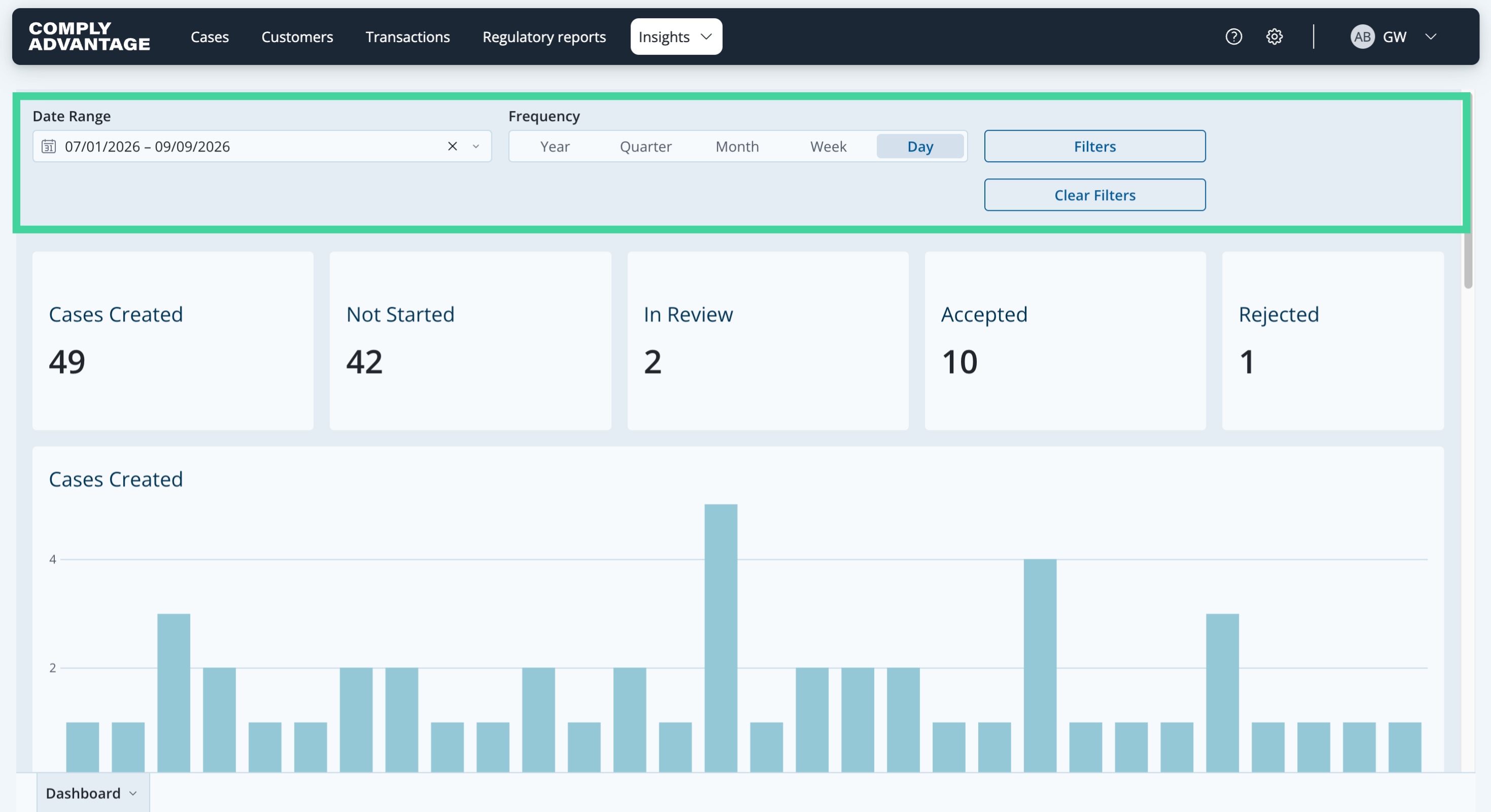
Right at the top of the page, there are a lot of options to customize the data you want to see. You can select the date range you want to analyze and the frequency of the data shown. You can also select various filters to tailor the data to your needs, and clear all selected filters.
6. Select filters
Here you can see the specific filters available: Label, Customer Country, Acquisition Source and Case Type.

7. Headline metrics
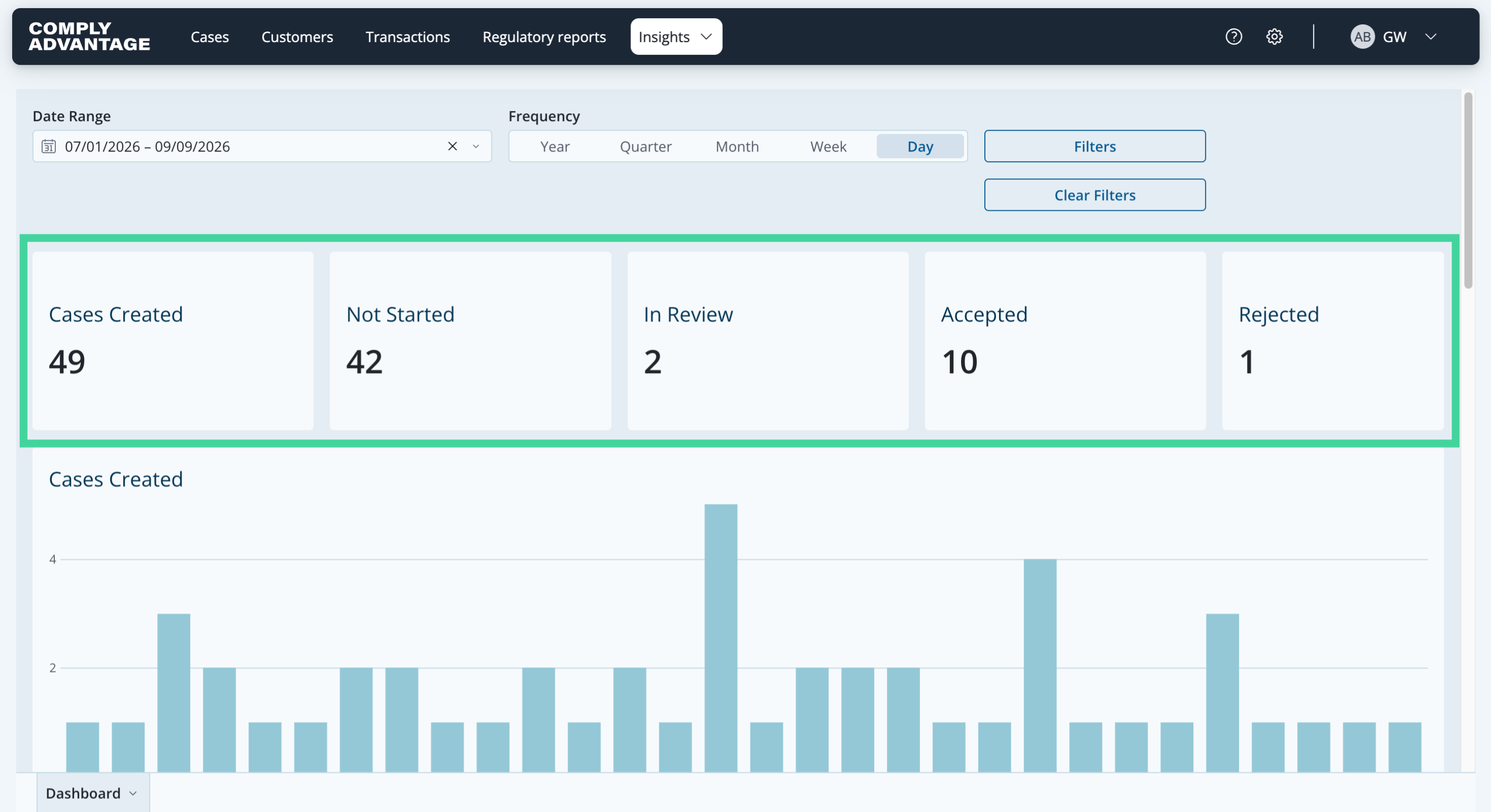
Once you have selected the date range, frequency and filters for the data you want shown in this dashboard, you can see the Cases created, Not started, In review, Accepted and Rejected.
8. Cases created
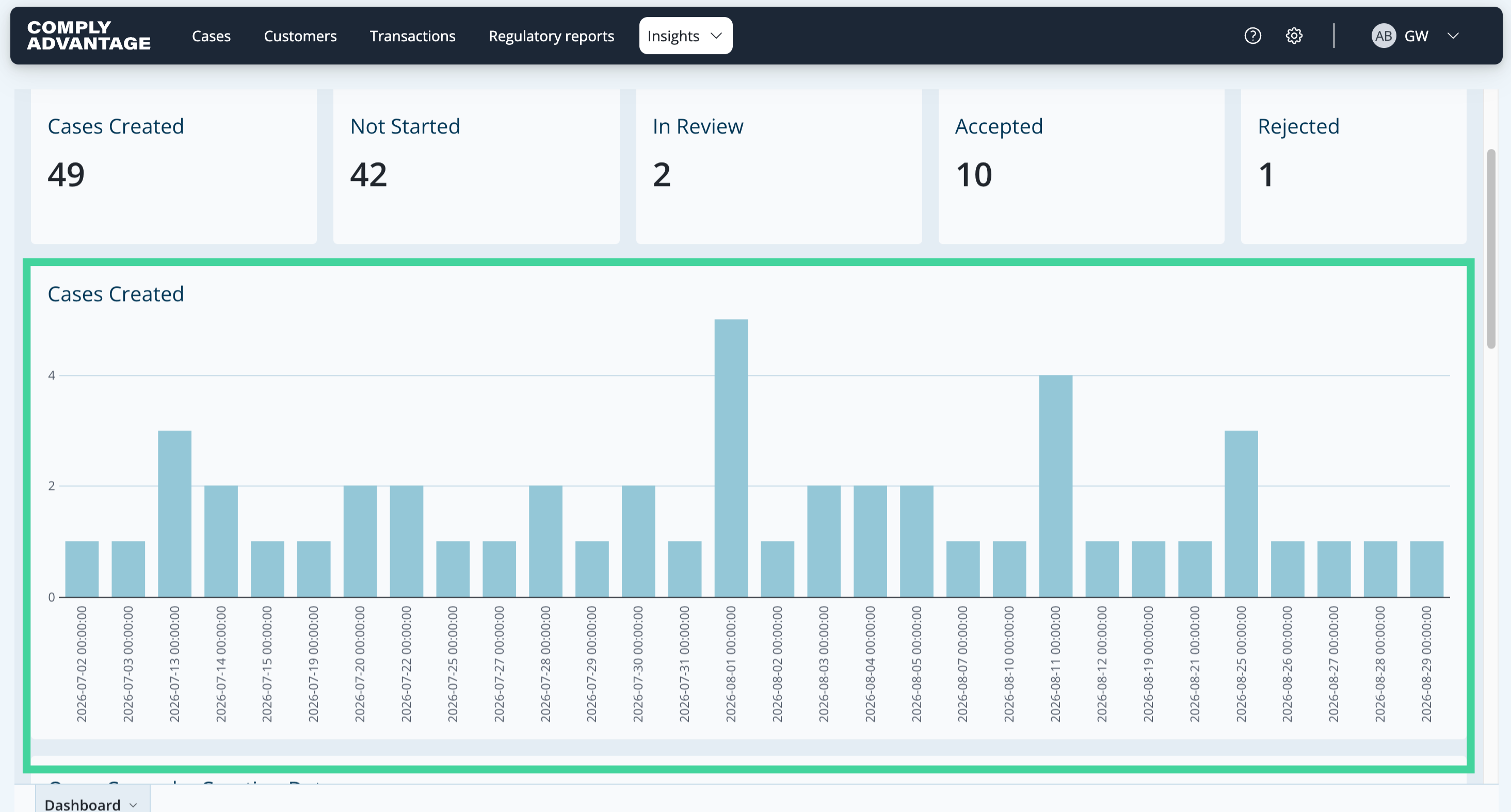
You are then provided with various charts to analyze this data. The first chart on this page is the "Cases created" chart. It shows the number of cases created by date.
9. Open cases, by creation date
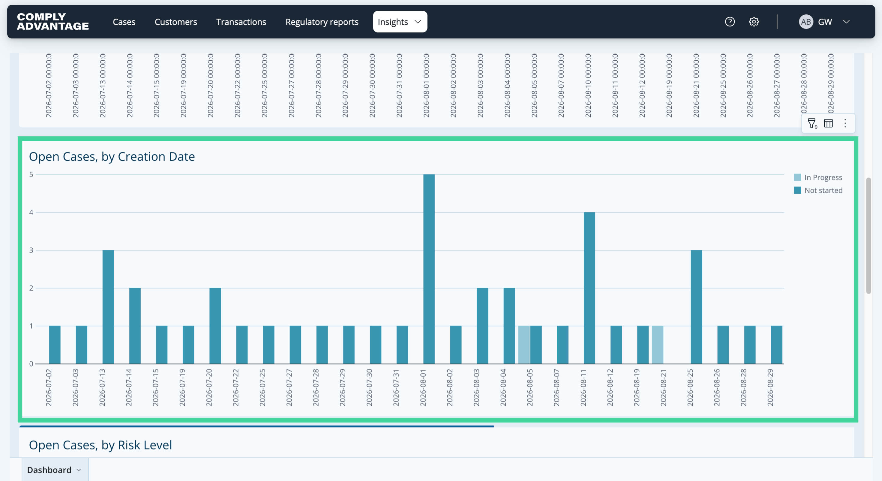
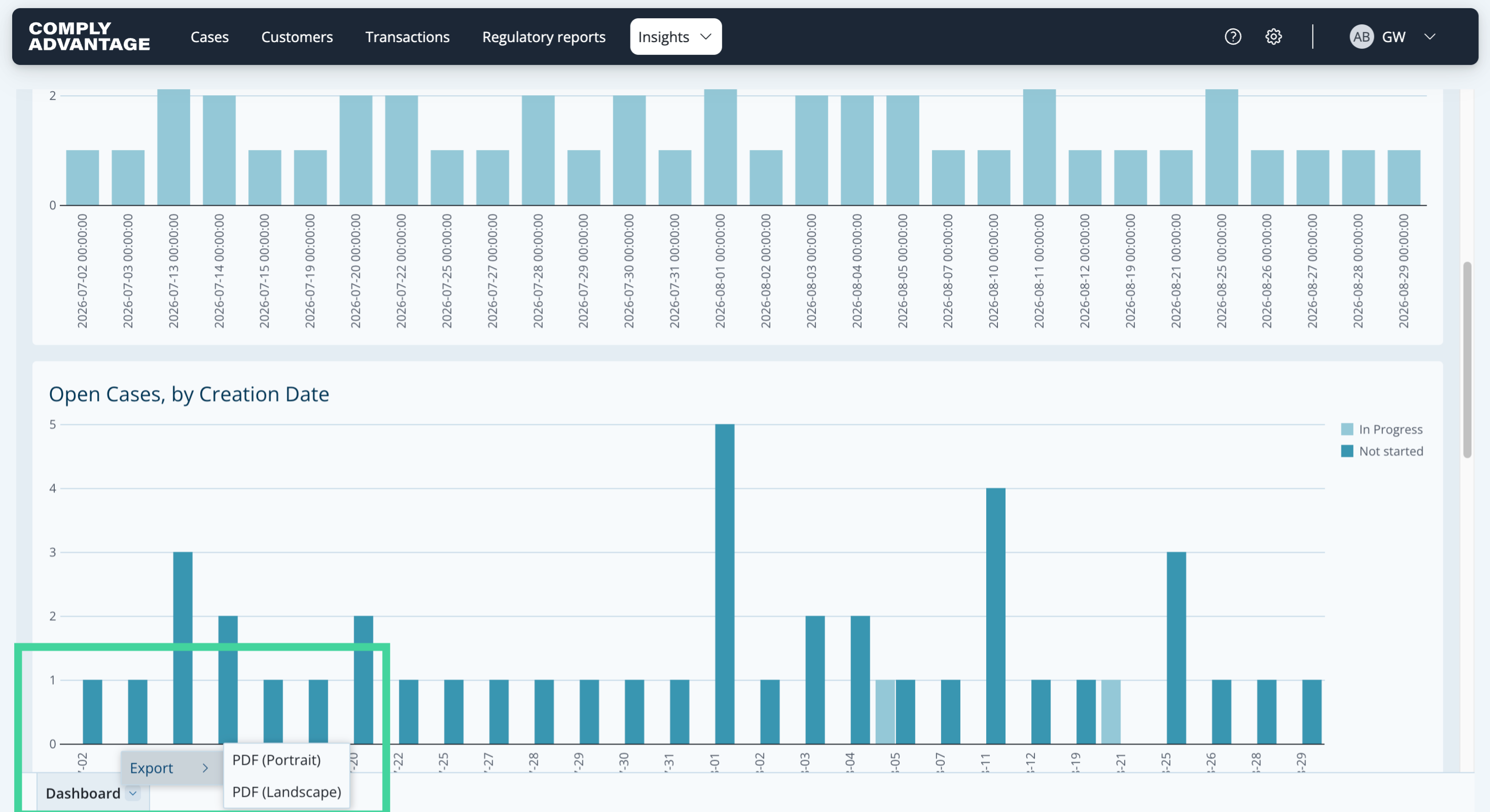
The second chart shows "Open cases, by creation date". It helps you understand how many cases are outside your service level agreement, and what proportion of them are already being worked on.
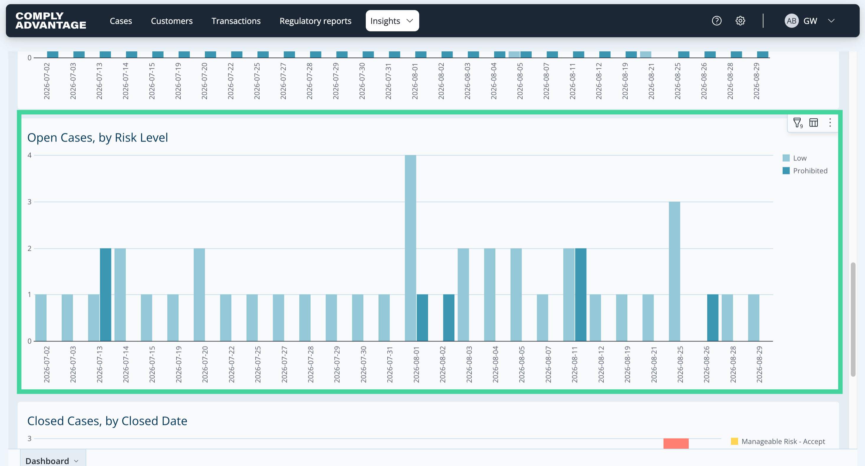
10. Open cases, by risk level
The third chart shows open cases by the respective customer's risk level, if your account uses risk scoring. It helps you understand how risky the currently open cases are.
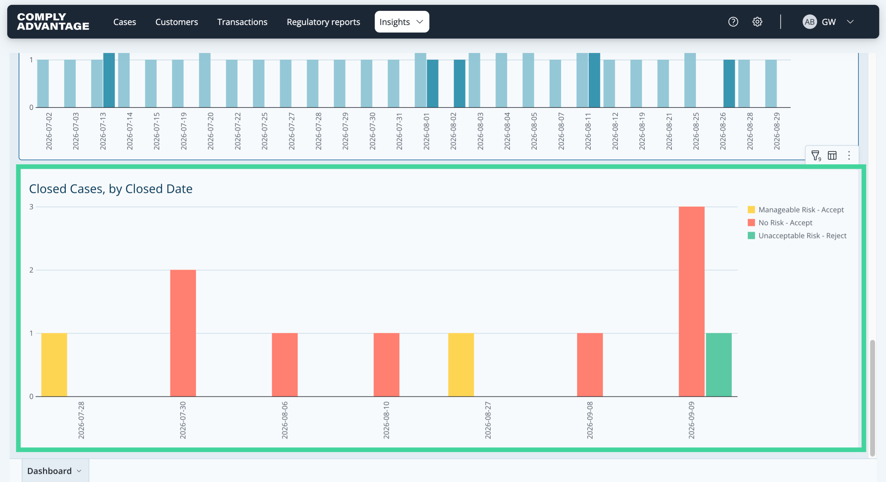
11. Closed cases, by closed date
The final chart presents information on closed cases. Here you can see the number of cases closed by date, along with the decision that closed them.
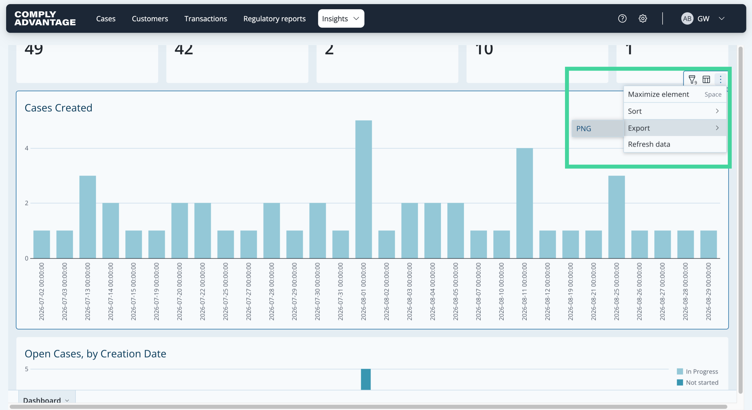
12. Export a chart as a PNG image
If you hover over a chart, three dots appear that let you maximize it to view it on the whole page, sort the data in it, export it as a PNG file, or refresh its data. To the left of the three dots, the chart also lets you filter the data in it directly, or show the underlying data.
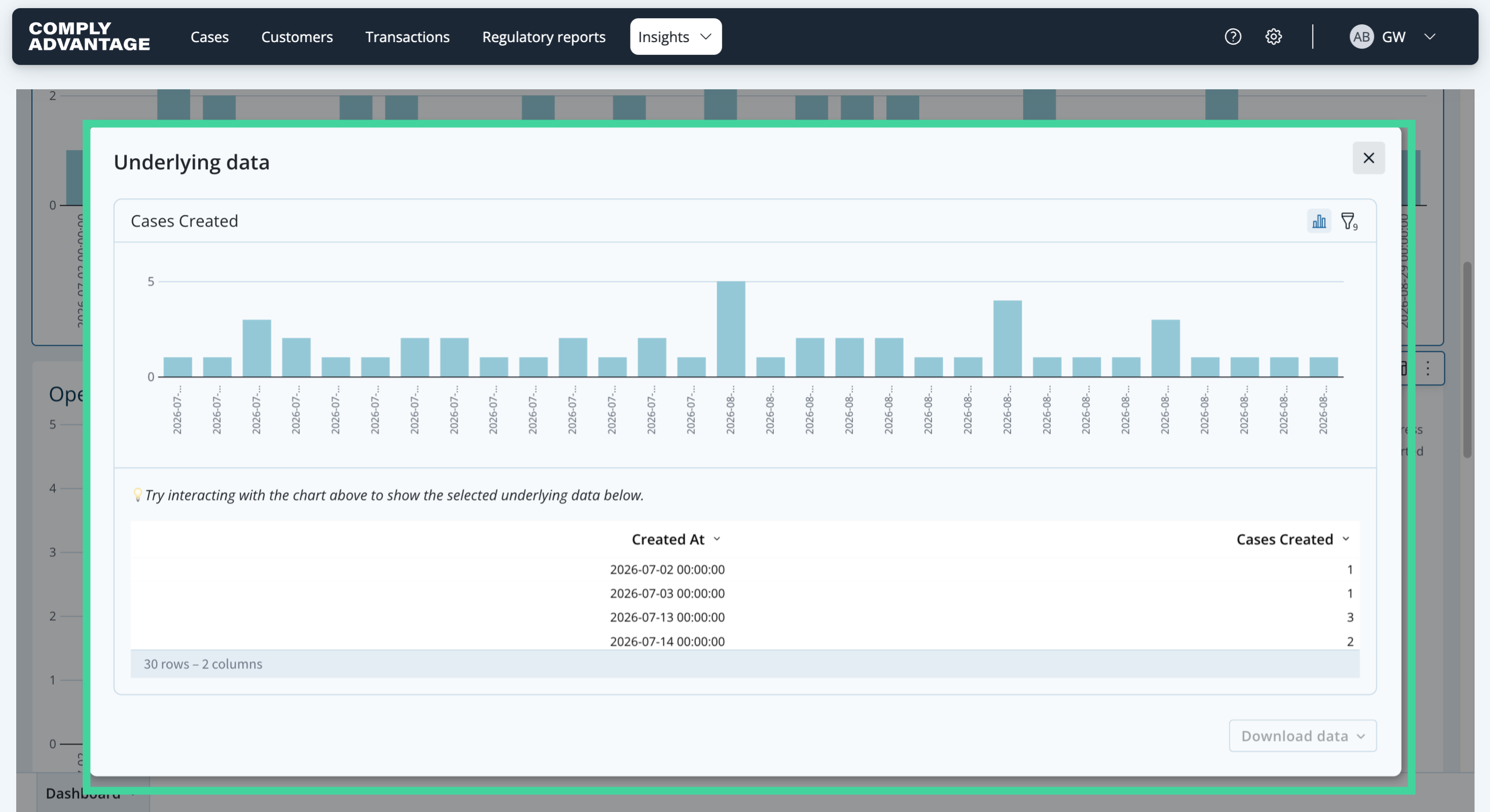
13. Show underlying data
"Show underlying data" shows the data behind the chart, which you can also download from the same panel.
14. Export the dashboard data
If you click the "Dashboard" button at the bottom and then select "Export", you can also download all the data shown on this page as a PDF, in portrait or landscape.
We hope this guide helped you learn to apply filters, export data, and navigate cases effectively for enhanced reporting capabilities.